
Divi Responsive Design Fixes: Rescuing the Last 5% of a Figma-Built Site
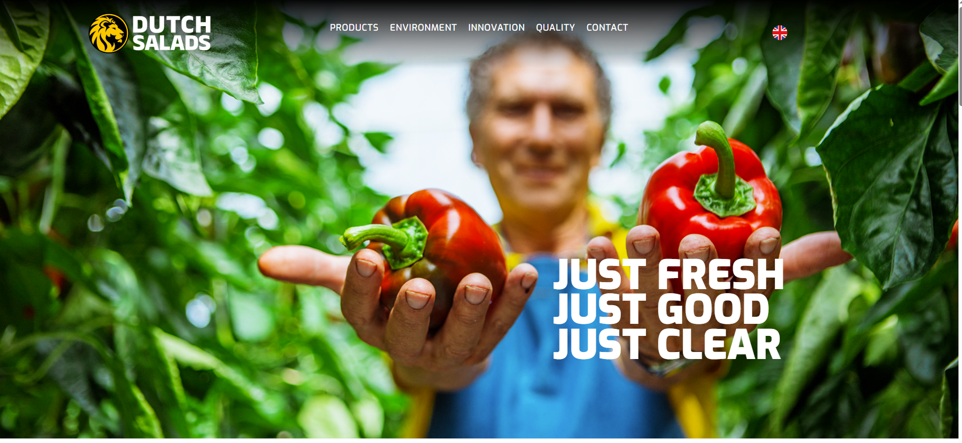
Building a WordPress site in Divi feels smooth until the breakpoints start fighting back. A menu wraps onto two lines. A hero image refuses to scale. A product grid vanishes between two screen sizes. This post is a real Divi responsive design fixes case study, based on a Fiverr project for a Dutch food brand, Dutch Salads. The client had a detailed Figma design and a site that was already 95% done. The final stretch was all responsive detail. This post is for designers and site owners who can build a layout but struggle to make it behave on every screen. You will see the exact problems, the decisions behind each fix, and the honest result — including the one mistake worth learning from.
The Client & The Problem
The client was a designer building dutchsalads.nl in Divi for their own end customer. They described the situation plainly. In their words, "I believe I am finished for 95%, but I keep getting stuck on some specific elements." The design itself was solid. A detailed Figma file defined every spacing value and breakpoint. The gap was purely in responsive behaviour.
The specific issues on the table
The header navigation broke too early. Links wrapped onto two lines as the screen shrank. The client wanted the menu to scale cleanly and only switch to the mobile version at 1200px. Two visual sections — a hero with kids and a yellow text block, plus the "Our Products" panel — were not scaling correctly. The product list images kept disappearing at certain widths. On top of that, the client wanted a quick check of the wider site for anything else worth fixing.
The deadline pressure
There was a firm timeline. The core fixes were needed by Tuesday night, with a scan report by Wednesday. Their own client was waiting downstream. That kind of layered deadline is common when you take on responsive WordPress fixes for another agency or freelancer.
What I Proposed
I kept the scope tight and honest. Rather than rebuild anything, I agreed to work inside the existing Divi structure. That respects the client's build and avoids surprises. I asked for two things before starting: the Figma file for reference and the WordPress admin logins. The price was set at $80 for the first round of fixes.
Working to the design, not around it
The Figma file was the source of truth. Every alignment, padding value, and column count was checked against it. When a client hands over a detailed design, guessing is the enemy. I map each breakpoint to the design so the result matches intent, not assumption. This is the same discipline I bring to custom Divi and Elementor work on any project.
A clear delivery rhythm
I proposed a simple loop. I fix a batch, the client reviews, then flags anything still off. That rhythm suits responsive work because issues only appear at specific widths. You cannot fix what you cannot see, so tight feedback matters.
The Build Process
The real work sat in the breakpoints. Divi gives you three default responsive views, but this design needed control between them. Several sections misbehaved in the gaps — for example, between 1200px and 980px, or between 980px and 768px.
Fixing the header and column logic
The menu was set to switch to mobile earlier, at the 1200px mark the client wanted. I aligned the menu items to the vertical centre of the logo and adjusted padding on the contact page. For the "Quality / Passion" text columns, the layout scaled poorly and stuck at the sides. The client asked for a clean 3 / 2 / 1 column pattern: three columns from 1440–1200px, two from 1200–980px, and one below 980px, all with consistent gap width. I rebuilt the column behaviour to match that exactly.
The disappearing product images
The product list images vanished when the layout stacked on mobile. This is a classic Divi image-sizing and breakpoint conflict. I reworked how the images scaled so they held position and shrank with the text. The client also wanted the fruit section built from separate components, like the vegetables, instead of one flat PNG. That change made the section responsive and far easier to maintain later. This kind of structural cleanup is central to solid Divi development services.
The alignment puzzle on inner pages
Later, the yellow "Our Products" block needed to sit right-aligned per the 1440px Figma view. On the Environment page, two columns were being squeezed narrow with unexplained side space. The fix combined resetting row padding, zeroing column margins, and correcting an oversized image that was forcing the layout. Small values, big visual difference.
An honest bump in the road
Midway, the client raised a fair concern: "I don't know what happened but you have overwritten a lot of my former CSS." Some global styling had been affected while fixing section-level issues. This was a genuine lesson. I addressed the follow-up list they sent and finished the remaining items, but the takeaway stuck with me. Careful CSS scoping matters as much as the fix itself, a point I return to below and apply across all WordPress speed and design help I deliver.
The Result
Every reported issue was resolved. The header switched to mobile at the right width. The hero and "Our Products" panels scaled cleanly. The column patterns matched the Figma spec across all breakpoints. The product images stayed in position and the fruit section was rebuilt from proper components. Inner-page alignment on the Environment and Innovation pages was corrected.
What the client said
The feedback through the project was steady and warm. At key milestones the client wrote "Ok much better!" and later "great work on all issues!" On final delivery they added, "Thank you Tallha for your work! It was very helpful." The project closed with a five-star review. Translated from Dutch, it read: "Tallha doesn't stop until the client is satisfied, very nice to work with."
The commercial outcome
The work ran across two orders, $80 then $40 for the extended issue list, delivered over roughly twelve days. The client's own end customer got a site that finally behaved on every screen. That is the point of good responsive WordPress fixes — the visible result belongs to the client, not the developer.
Key Takeaway
The biggest lesson here is not about a single breakpoint. It is about respecting an existing build. When you fix responsive issues inside someone else's site, your job is to change only what needs changing.
Scope your CSS carefully
Global styles are easy to touch by accident. Target rules to specific sections, IDs, or classes wherever possible. The CSS-overwrite concern in this project was a reminder that a fix which breaks something else is not a fix. Precision protects trust.
Let the design lead
A detailed Figma file removes guesswork. Match exact padding, column counts, and breakpoints rather than eyeballing them. This is how you avoid endless revision loops on responsive work.
Build sections from real components
Flat images look fine until they need to scale or stack. Rebuilding the fruit section from separate elements made it responsive and future-proof. Structure beats shortcuts every time.
If your Divi or Elementor site is stuck at that frustrating final stretch — where the design is right but the breakpoints won't cooperate — this is exactly the kind of work I do every week. You can hire a WordPress developer who fixes responsive issues cleanly, respects your existing build, and works to your design spec. Explore the full range of CodeSyte services and send over your issue list. The last 5% is often the difference between a site that looks done and one that truly is.