
Building an Elementor Gaming Landing Page for a Team Fortress 2 Community
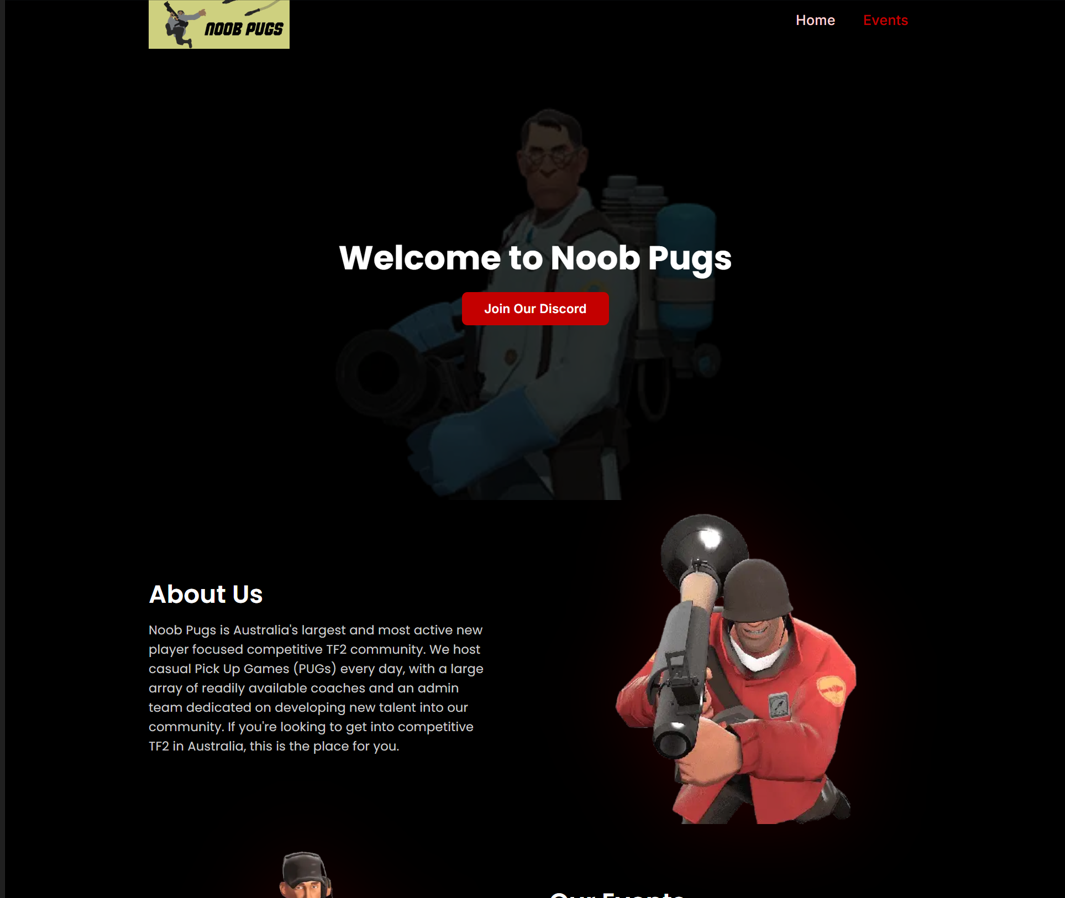
Every gaming community eventually outgrows its Discord invite link. Players want a real home online — something that looks the part before anyone even clicks "Join." That was exactly the situation when a Team Fortress 2 community called Noob Pugs came to me on Fiverr. They needed an Elementor gaming landing page that felt like a gallery, funnelled visitors straight to Discord, and later grew into a proper events hub. This post walks through the full case study: the brief, the build, the honest scope conversation, and the 5-star result. It's written for indie game communities, esports organisers, and anyone weighing up a custom WordPress landing page instead of a generic template. If you run a community and want your site to match your vibe, you'll find something useful here.
The Client & The Problem
The client, a gaming community operating under the domain noobpugs.com, ran pick-up games (PUGs) for new Team Fortress 2 players. Their goal was simple to state but tricky to execute well. They wanted one striking landing page that introduced the community and pushed every visitor toward their Discord server.
The aesthetic brief was specific. The page had to use a solid black background throughout, with transparent-background PNGs of TF2 characters arranged artistically around the text. No white boxes. No clutter. The look they wanted was elegant and gallery-like, with alternating text blocks and full-width images.
There were constraints too. The site was hosted on Elementor's cloud platform, so all editing had to happen inside Elementor Pro. The Discord button needed TF2-red (#c40000), headings in bold white, and body copy in light gray (#cccccc). On top of that, the initial delivery window was extremely tight — barely a day. For teams facing similar branding-led builds, my WordPress design and development services exist to translate a mood board into a working, responsive page.
The Deeper Challenge
The real problem wasn't just design. It was scope clarity. The client later wanted dynamic tournament pages with auto-updating brackets. That's a very different build from a static landing page — and being honest about that difference mattered more than saying yes to everything.
What I Proposed
I proposed a single Elementor template built around the client's exact section list. The hero would carry a centered white heading, "Welcome to Noob Pugs," with a red Join Our Discord button and a Discord embed. Behind the text, I'd place a transparent character image at low opacity for an artsy accent.
Below that, I mapped out alternating "About" blocks — text on one side, a large transparent PNG on the other — broken up by a full-width image acting as a visual breather. The page would close on a bold final call to action: "Ready to Jump In?" with a second Discord button.
Crucially, I proposed building it mobile-first in principle, stacking each text-and-image pair vertically on smaller screens so nothing shrank into unreadable territory. Clear scoping like this is the backbone of how I approach Elementor landing page projects, because a tidy brief prevents messy revisions later.
The Build Process
The build started with an access hurdle, which is worth being honest about. The Elementor cloud invite didn't arrive on the first attempt. I followed up twice before the client re-sent it, and only then could work begin. That delay ate into an already short timeline.
Managing the Timeline Honestly
With only around five hours left before the original deadline, I requested a one-day extension rather than rushing a weak build. The client agreed instantly: "1 day extension is okay 👍." That single decision protected the quality of the whole page. Setting realistic timelines is something I treat as non-negotiable across my WordPress development services.
Design Decisions Inside Elementor
I built the entire landing page as one Elementor Pro template. The transparent PNGs were layered around the copy using positioning and opacity controls, keeping the gallery feel the client wanted. The Discord button used the exact TF2-red hex, and the embed was added so visitors could preview the server without leaving the page.
A minor technical note came up around image formats. Some assets were supplied as WebP files at small sizes, and a few PNGs were low resolution. I flagged this directly instead of silently upscaling and losing quality. The client preferred to swap the images himself later, which we agreed on cleanly.
Extending Into an Events Hub
Once the landing page landed well, the client asked for more. He wanted an Events Listing page and dynamic event-detail pages with double-elimination brackets, powered by the CyberPress tournament plugin. We extended the deadline again to make room.
I built the Events page in the same black, art-accented style, pulling tournaments from CyberPress into a clean list. But the third page — dynamic detail templates where bracket data updates automatically from the backend — was a bigger job. Rather than overpromise, I explained it honestly. Static per-event pages fit the standard package; a fully dynamic, self-updating bracket system belonged in a premium tier. This kind of transparent scoping is central to my membership and custom WordPress builds.
The Result
The client accepted the scope explanation without friction and chose to close the project after one final tweak — a top-right "Events" menu link on the landing page connecting the two pages. I added it and delivered.
The outcome was a cohesive, two-page site: a striking Discord-focused landing page and a matching events hub, both responsive and both true to the community's dark, artistic identity. The client left a 5-star review across communication, quality, and value, with the words: "I enjoyed the end product."
Because he was new to Fiverr, that review carried real weight. It came from clear communication, honest deadline management, and refusing to cut corners on the design. Delivering repeatable quality like this is what I aim for in every WordPress project I take on.
Key Takeaway
The lesson here is that honesty scales better than yes-to-everything. Two moments defined this project: asking for time instead of rushing, and drawing a clear line between a static build and a dynamic one. Both could have felt like friction. Instead, they built trust.
Practical Lessons For Readers
If you're planning a community or gaming site, decide early whether your events content is static or dynamic — the cost difference is significant. Supply high-resolution images from the start, because small WebP files rarely hold up on full-width layouts. And always leave buffer time for hosting access, which delays more projects than the actual design work does.
A landing page isn't just decoration. Done right, it's a funnel that turns curious visitors into active community members.
If you want a custom, brand-accurate WordPress or Elementor build — landing page, events hub, or full site — I'd be glad to help. Take a look at the full range of CodeSyte services and tell me what your community needs. Honest scoping, clean delivery, and a design that actually looks like you — that's the standard on every project.