Building a Marketing Agency WordPress Website From a $100 Theme and a Phone Screen
A client messages you at 6pm asking for a four-page site in 24 hours. They already own a premium theme. It sounds like the easiest job of the week. Three weeks later you are still adjusting logo spacing at 3am.
That is the honest story of this marketing agency WordPress website project for Wise Ads, a performance marketing agency operating from the UAE. It started as an $80 Fiverr order and turned into a full brand rebuild, a Figma-led redesign, a live domain migration and an SMTP fix.
This post covers what was actually promised, what changed midway, how the build was managed without hosting access, and what I would do differently. It is written for freelancers pricing fixed-scope work, and for business owners who want to understand why "just edit my template" is rarely just editing a template.
The Client & The Problem
Issa runs Wise Ads, a performance marketing and media buying agency with clients across crypto, streetwear and NFT brands. He came through Fiverr with a clear, tight brief.
His opening message set the tone: "I'm looking for someone who can build me a 3/4 page website within 24hrs for my marketing agency. I already have a template I purchased for $100 so it's just about editing it for me using WordPress."
The Starting Position
The theme was Orbius, a creative agency and portfolio theme from ThemeForest. The plan was simple on paper. Strip the demo down to four pages, drop in the Wise Ads branding, and hand it back.
Two problems appeared within hours of starting.
First, there was no hosting access. A previous developer held the credentials and was travelling. Issa could not reach him. Second, there was no written content. No copy document, no image library, no brand guide.
The Constraint Nobody Mentions
The biggest constraint was not technical. Issa was reviewing every single change from his phone. He said it plainly: "It's hard for me as I'm working off a phone. So I am limited to what I can do."
That meant mobile-first feedback on a desktop-first theme. Every spacing complaint, every logo alignment issue and every font judgement arrived as a phone screenshot. Desktop was not checked properly until much later in the project.
What I Proposed
My original quote was $100 for four pages. Issa mentioned another seller had offered $80 including full content input. I matched it and agreed to $80 on the condition that three things were supplied.
Those three things were website login details, the logo file, and the page content as text and images. This is the standard intake I use across all WordPress development services at CodeSyte, because content is what determines layout, not the other way round.
Working Around the Access Problem
Since credentials were unavailable, I proposed building on my own staging environment from the theme ZIP file, then migrating everything once the domain was ready. Issa agreed instantly: "Couldn't we start it based on the template file I'll send you the zip. Then we work through it together and I transfer it over once it's done."
A first staging build was online within roughly twelve minutes of receiving the theme. His response was "Amazing your quick", which set a good early tone. That staging-first approach is something I now default to for any custom WordPress build where hosting is uncertain.
The Revision Commitment
Issa was new to Fiverr and nervous about revision limits. He asked directly how many revisions he would get. I told him I would keep working until he was satisfied.
That sentence is the single most expensive thing I said in this project. It was also, in hindsight, the reason it ended in a five-star delivery and a tip.
The Build Process
The build ran from 25 June to 15 July 2025 across three environments. A temporary staging link, a working subdomain, and finally the live domain at getwiseads.com.
Phase One: Building Without a Brief
For the first two days the site was assembled from fragments. Partner logos arrived one image at a time. Client names came as a plain list. Copy arrived as long chat messages rather than a document.
Issa was candid about why: "There way to much going on with the Website so it's hard to give the exact content." Later he added, "Couldn't you just design it yourself section by section based on what company does then we can work from there."
This is the point where a fixed-price template edit quietly becomes a design project. I built out the homepage structure using the copy he had pasted, then iterated section by section from screenshots.
Phase Two: The Direction Change
On 2 July, Issa's colleague Alisa joined the conversation. Her assessment was direct and, honestly, correct: "I've had a look at the site and feel it is too 'corporate looking' for what we envisioned."
She sent a full page-by-page amendment list. Navigation was restructured. The About section was rewritten around three blocks called Born from disruption, We Believe and Our mission. The Approach, Partnership and Portfolio sections were cut. The hero became a looped video with an overlaid headline.
Two days later a Figma file arrived. That single link changed the project completely. Issa put it well: "hopefully this gives you a better idea of what we want visually to achieve."
From that moment revisions became measurable. Instead of "make it bigger", I had exact spacing, type scale and layout references. Anyone commissioning Elementor and Divi design work should send a design file first, even a rough one.
Phase Three: The Components That Ate the Timeline
Three elements consumed most of the remaining hours.
The partner logo carousel needed BloFin, Bybit, KuCoin, Bitget, BingX, TradingView, MEXC and WOO X displayed at visually equal size, in colour, auto-scrolling rather than click-driven. Source logos had wildly different aspect ratios and colour treatments. Normalising them took several passes.
The testimonial carousel was rebuilt at least six times. The requirement was bordered cards, bold quotation marks, equal card height, company logos aligned on a single baseline, and auto-movement. Reviews were different lengths, so equal alignment and full text visibility pulled against each other. The final solution set a fixed card height with balanced internal spacing, and one testimonial was shortened by the client to fit.
The page-specific footers needed different hashtag lines per page. The homepage closes with #WiseMoves, the Partner With Us page with #WisePath, while About kept its original. Small detail, real implementation cost.
Phase Four: Migration and the Email Bug
On 11 July the site was migrated to getwiseads.com. Issa immediately reported that the contact form was not delivering to the Gmail inbox.
The host had no working mail transport for form submissions. I configured SMTP delivery and retested. His reply was short: "It works." Order delivered. This kind of post-launch triage is bundled into every website maintenance and support package I run.
Phase Five: The Post-Delivery Round
Delivery was not the end. That evening Issa finally viewed the site on a desktop and found alignment issues that had never shown on mobile.
He was frank: "Bro I'm a little upset because there was things I asked you to do and you didn't do it. When I checked on desktop the website looks different."
He sent a 19MB PDF listing every remaining amendment with annotated screenshots. Four more days of work followed, unpaid under the original order, until the mobile and desktop versions matched.
The Result
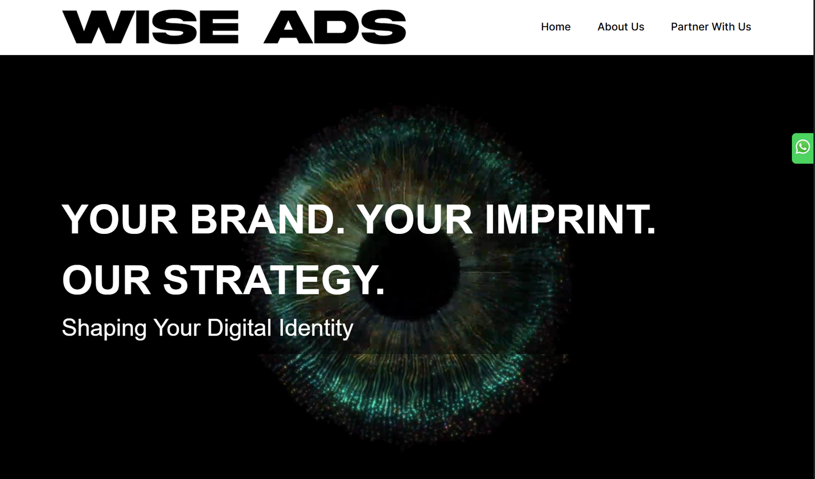
Wise Ads went live at getwiseads.com with three public pages. Home, About, and Partner With Us. The Work page was built but hidden from navigation because case study assets were not ready.
What Was Delivered
The final site includes a video hero with the headline "Your Brand. Your Imprint. Our Strategy.", a six-block service grid covering performance marketing, lead generation and social media management, an auto-scrolling partner carousel, a four-card client testimonial slider, a floating WhatsApp button, a five-language switcher covering English, Arabic, German, Spanish and Turkish, payment method icons, and a working SMTP-backed contact form.
Client Sign-Off
On 14 July, after the desktop pass, Issa wrote: "Desktop looks perfect." The following night, after the last mobile alignment fixes, the project closed with "Thank you bro all is perfect."
He sent a $20 tip unprompted on 15 July. His written review read: "Tallha delivered exactly what was outlined in the brief. He was responsive to all requested revisions and handled the adjustments professionally."
The Honest Part
The review also flagged areas to improve, including cooperation, understanding and proactiveness. I am including that because it is fair. On several occasions I asked the client to clarify something instead of making a judgement call and showing him the result.
He hired a developer expecting initiative. He said so directly during the tense stretch: "I choose you because of your experience if I knew I had to do all this myself I wouldn't off bothered." That feedback changed how I run discovery on every project since.
Key Takeaway
This project delivered, and the client was happy. But the economics were bad, and the lessons are worth more than the fee.
Content Is the Real Deliverable Timeline
The 24-hour request was never realistic, not because of build speed, but because the content did not exist yet. A four-page site with finished copy and assets is genuinely a one-day job. A four-page site where copy is written in the chat window is a three-week job.
If you are hiring, prepare copy and images before the developer starts. If you are building, make content delivery a written precondition and pause the clock when it stalls.
Ask for a Design Reference on Day One
Everything improved the moment the Figma file arrived. Before it, feedback was subjective. After it, feedback was measurable. I should have asked for a reference site or a rough mockup within the first hour instead of the tenth day.
Test Both Breakpoints Before You Deliver
The client only had a phone. That meant desktop went unreviewed until after delivery, which created an avoidable second round of work. Now I record a desktop walkthrough video and send it whenever a client is mobile-only, so approval covers both views. Responsive parity is checked as standard in my speed optimisation and QA process.
Unlimited Revisions Need a Frame
Saying "I'll revise until you're happy" is good service and bad pricing. The better version is unlimited revisions within the agreed scope, with a paid change order when the design direction changes. Wise Ads did not change direction dishonestly. The project simply grew, and there was no mechanism to price that growth.
Work With CodeSyte
A premium theme is a starting point, not a finished website. The gap between a theme demo and a live brand site is filled with content decisions, responsive testing, asset preparation and post-launch fixes. That gap is where most projects overrun.
If you have a theme sitting in a ZIP file and a brand that deserves better than the demo content, that is exactly the work I do. Whether it is a marketing agency site, a WooCommerce store, a membership platform or a rescue job on a build that stalled, you can review everything on offer at CodeSyte's services page and send over your brief.
Bring your theme, your copy and a rough idea of the look you want. I will handle the rest, and I will tell you honestly if the timeline you have in mind is achievable before you pay anything.