
WordPress Homepage Redesign for a Ministry Website: An Honest Case Study
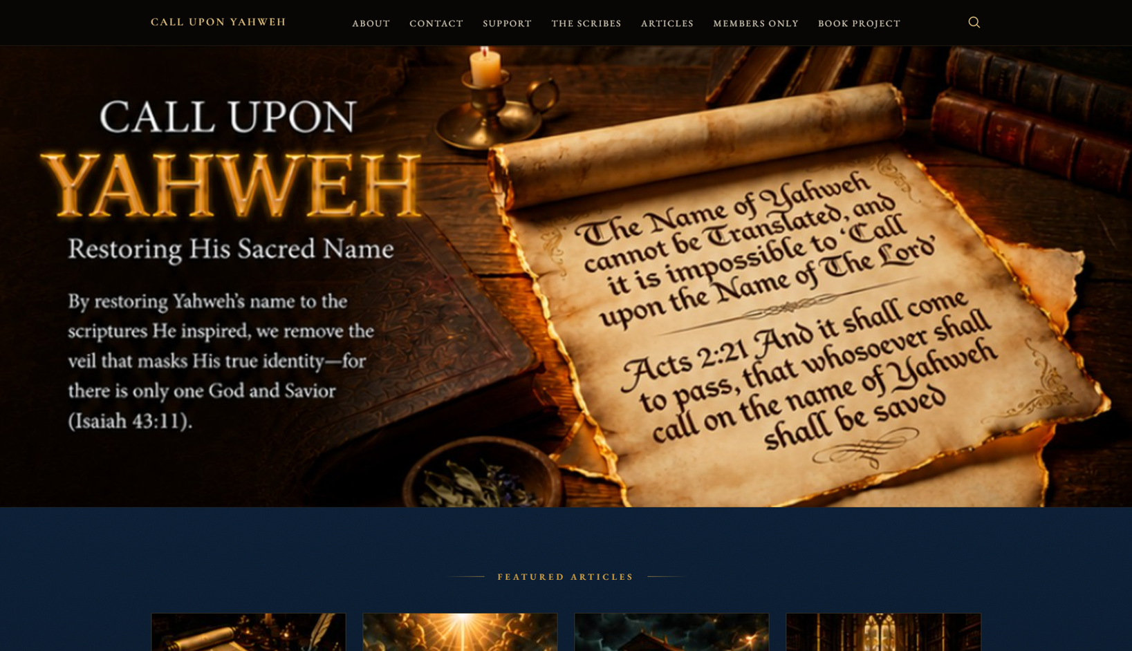
Many ministry and nonprofit owners hit the same wall. They have a live WordPress site, a message they believe in, and a rigid theme that fights every change. This case study walks through a WordPress homepage redesign I completed for John, owner of a Sacred Name ministry site at calluponyahweh.com. He came to me wanting a full membership platform. What he actually needed first was a homepage that could capture visitors and grow an email list. This post is for ministry leaders, small charities, and solo founders deciding whether to fund a large build or start smaller. I will share the honest strategy, the tools, the design decisions, and the real outcome — including the parts most freelancers would leave out.
The Client & The Problem
John runs a ministry focused on restoring the Sacred Name across scripture. He had a live WordPress site hosted on Namecheap, with DNS on Cloudflare, plus Wordfence, Brevo, and WP Mail SMTP already installed. He did not need a site built from scratch. He needed the existing one to do more.
The Original Request
His first message asked for a dual-track payment system. Track one would be a recurring membership using Paid Memberships Pro. Track two would be a pay-what-you-want donation flow through PayPal. He also wanted to avoid WooCommerce entirely to keep the database light. It was a well-researched brief for a $250 budget.
The Real Constraints
Two problems sat underneath the request. First, his site used a locked-down custom theme called "Lhotse" that resisted normal editing. Second, he had no supporters or email list yet. Spending heavily on a membership engine before validating the audience carried real risk. The honest question was not "can this be built" but "should it be built first."
What I Proposed
I could have simply accepted the membership job. Instead I mapped the full scope and found it was larger than a quick setup. It involved two access tiers, PayPal recurring plus donations, Brevo automation from scratch, and a homepage redesign. Treating that as a $250 task would have risked quality on a live site.
A Phased Strategy Instead of a Big Build
I recommended building only what the ministry needed today and scaling later. The membership platform could wait until there were members to serve. My advice was to lead with a homepage that built trust, explained the mission, and captured emails. You can see the range of options I usually present on my WordPress development services page.
Why the Homepage Came First
The homepage is the first thing a visitor judges. It decides whether they subscribe, support, or leave. I proposed a mission-focused layout with a hero message, a free-chapter lead magnet, a "Join the Community" signup, an e-book section, and a clear support call to action. This kind of conversion-focused homepage design creates a foundation before any paid membership logic is added.
John agreed with the direction. In his words, this phased approach was "a perfect analysis and initial approach towards expansion." We locked the first stage around the homepage.
The Build Process
The goal for this phase was a design the client could approve with confidence and a developer could implement cleanly. I delivered it as a fully interactive HTML prototype rather than a flat image, so John could feel the animations and hover effects before anything went live.
Designing the Prototype
I used AI tools as a brainstorming aid to explore layout directions quickly, then refined everything by hand into a cohesive design. The aesthetic matched the ministry's tone — aged parchment textures with gold lettering, reverent and clean. The final structure had five sections: a header with clear calls to action, a featured articles band, a book section, an email study signup with a lantern motif, and a bottom archway section leading visitors toward support.
The detail John loved most was a "Read Chapter One" popup. Clicking the book cover opens the free-chapter offer directly, turning curiosity into an email signup without sending anyone hunting through the menu. That single element became the strongest lead-capture asset on the page. Interactions like this sit at the heart of my membership and landing page work.
Solving the Theme and Technical Questions
The "Lhotse" theme was the biggest obstacle. It allowed changes but forced custom coding for basic layout work, which slows everything down. I recommended moving to a flexible builder like Elementor or Gutenberg on a lightweight base theme such as Astra or Hello Elementor. That path keeps future design changes and membership features fast to implement.
I also answered a long list of stack questions honestly. Brevo's Starter plan was enough for now. No paid Brevo plugin was required. FuseWP was optional, not essential. WP Mail SMTP and Brevo serve different jobs and work together. For caching, I advised excluding login, registration, checkout, and account pages so members always see real-time data. Careful speed and caching optimisation matters as much as design on membership sites.
Working Through Revisions
This project ran on iteration. John sent screenshots, Word documents, and reference images, and we refined the layout section by section over several rounds. We adjusted section backgrounds, swapped the book imagery, corrected scripture text on the cover, and reworked spacing until it felt right. A few short calls kept the feedback clear despite a nine-hour time difference between Pakistan and Florida.
The Result
The final deliverable was an approved, interactive homepage prototype ready for development, plus shareable image versions for his team. It gave the ministry a professional visual identity and a working email-capture concept, all without the cost of a full membership build the audience was not ready for yet.
What Was Delivered
John received a polished homepage design with working animations, the book-cover popup, an email study signup, and a clear support path. The order was completed with a five-star review. The design also became the blueprint his existing builder was meant to implement, which set up the larger rebuild we are now planning together.
The Client's Words
John's feedback was generous throughout. Early on he wrote, "You are hands down the best of the best. I'm so impressed." After delivery he added, "The homepage design we developed is truly stunning, and his responsiveness and expertise have consistently exceeded my expectations." He also said the result was "more than I could have imagined," and that he was "blown away" by the call-to-action popup. That trust is now carrying us toward a full standalone build and members' area.
Key Takeaway
The clearest lesson here is that the honest recommendation and the profitable one are usually the same. Talking a client out of an oversized first purchase built more trust than a quick "yes" ever could.
Lessons for Ministry and Small-Business Owners
Start with the asset that grows your audience, not the one that manages an audience you do not have yet. A strong homepage and email capture come before a membership engine. Do not let a rigid theme dictate your future. And treat your design as a prototype you can feel, so approvals are confident and development is clean. Phased builds protect your budget while still moving you forward. If you want that same phased, honest approach applied to your own site, my WordPress and membership site services are built exactly for it.
If you run a ministry, nonprofit, or small business sitting on a message that deserves a better website, the smartest first step is rarely the biggest one. A focused homepage redesign can start capturing subscribers now and lay the groundwork for memberships, donations, and automation later. When you are ready to plan your own phased build, take a look at what I offer at codesyte.site/service and let's map the right first stage for your goals.