
Building a High-Converting VIP Membership Landing Page for a Research Community — PeptidePro Case Study
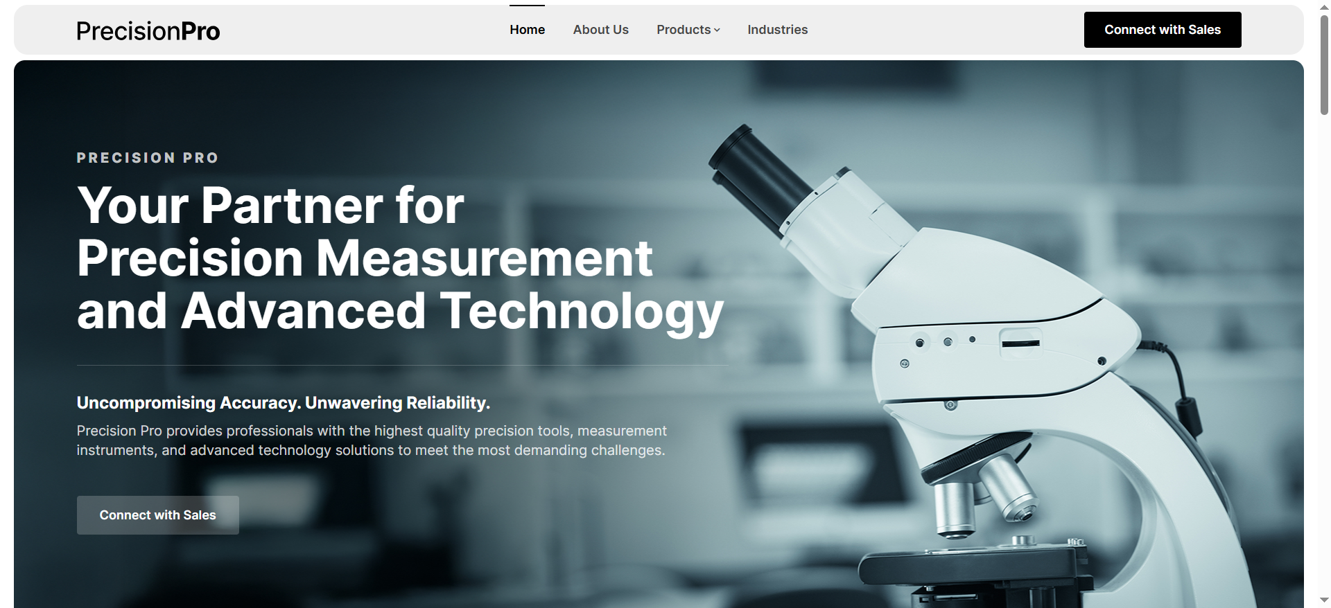
You have your subscription tiers planned, your Discord server being built, your WHOP store handling payments, and your ad campaigns ready to launch. All you need is the landing page that connects all of it — a clean, premium, high-converting page that communicates exclusivity, explains the three membership levels clearly, and sends visitors directly to subscribe. That was the brief from PeptidePro, a research community platform built around peptide research. They needed a WordPress membership landing page with three VIP tiers, integrated with Discord and WHOP, built for ad traffic and email campaigns. This post covers every decision — from the initial brief to the design revisions that made the final page convert.
The Client and the Problem
Who They Were
PeptidePro (peptidepro.io) is a research-focused community platform offering verified researchers access to exclusive compounds, advanced tools like a full peptide calculator suite, peer collaboration channels, specialist Q&A, early product access, and private batch compounds. The community was structured across three VIP membership tiers — Bronze at $1.99/month, Silver at $5.99/month, and Gold at $9.99/month — each with distinct access levels designed around a clear upsell funnel: Bronze to build volume and funnel members upward, Silver as the primary recurring revenue tier for serious researchers, and Gold as the elite high-LTV tier with exclusive product drops, 50% off coupons, and one free product per year.
What Was Needed
The client's development team was handling the Discord server, bot setup, and WHOP subscription store separately. What they needed was a standalone landing page on a separate domain (precisionpro.io) — built for paid ad traffic and email marketing campaigns — that explained the membership proposition, presented the three tiers clearly with a comparison chart, and pointed every CTA button to the appropriate Discord or WHOP destination. No payment gateway on the landing page itself. No membership plugin. No complex backend. Just a premium, conversion-focused page that felt private, locked, and authoritative.
The client provided a full content brief in advance — landing page copy structured section by section, and a complete membership tier comparison chart with every benefit mapped across all three tiers. Having this level of pre-prepared content is exactly what makes a landing page build fast and accurate. It is part of how I approach every WordPress landing page design project at CodeSyte — asking clients to prepare content before development begins rather than designing around gaps.
What I Proposed
$100 Fixed — Focused Scope
The original budget was $250. After the client clarified that the subscription system, Discord setup, and bot configuration were all being handled externally — the landing page was purely a design and CTA-routing task — the scope was correctly reduced to $100. This is an important pricing principle: the right price for a clearly scoped, single-deliverable task is the price that reflects the actual work, not the original estimate. Over-scoping a simple job creates a mismatch between what the client expects and what is actually needed, which leads to friction. Scoping accurately and pricing accordingly is the approach I take on every project at CodeSyte.
The tool stack was WordPress with Elementor on the client's existing precisionpro.io installation. No additional plugins were required — the page was pure Elementor design with external links for all CTA buttons.
The Build Process
Initial Design — Structure and Hierarchy
The initial build followed the client's content brief directly — hero section with headline and subheadline, a "Why Researchers Join" benefits section, a three-tier membership comparison table, and CTA buttons routing to Discord and WHOP. The first delivery established the overall structure, layout hierarchy, and tier differentiation.
The client's initial feedback confirmed the overall design and layout were solid — but identified two specific areas for revision: the hero section and the "Why Researchers Join" section. The hero had used stock imagery of people, which conflicted with the brand's intended tone of private, locked, and professional rather than promotional. The "Why Researchers Join" section needed imagery that felt research-specific and proprietary rather than generic.
The Design Brief That Made the Final Version
The revision brief was specific and genuinely useful. For the hero section, the client suggested visual directions including a lock and key abstraction, a vault door crack, light breaking through darkness, or a layered cards silhouette — all evoking exclusivity and gated access rather than community or lifestyle. For the "Why Researchers Join" section, the suggestions included blurred UI screenshots, a calculator mockup, or a Discord channel preview with names blurred — all signalling real product utility without revealing proprietary content.
This kind of visual direction brief — where the client describes the feeling and metaphor they want rather than specifying exact images — is actually more useful than a direct image reference, because it explains the intent behind the aesthetic choice. A vault door crack communicates: this is private, access is earned, not everyone gets in. A calculator mockup communicates: this is a real tool, not just a community. These are conversion signals, not just design preferences.
The revised design removed all stock people imagery entirely, rebuilt the hero as a text-only authoritative statement section, and applied the abstract visual treatments the client described. The tier comparison chart was also refined: contrast between tiers was increased, Silver was made more visually dominant as the primary revenue tier, and a short one-line descriptor was added under each tier name — "Best for active researchers" under Silver, for example — to guide visitor decision-making without requiring them to read every row of the comparison table.
Tone and Positioning — Private, Not Promotional
The headline and subheadline were updated to the client's final approved copy: "A Private Research Collective for Verified Researchers" as the headline, with "Secure access to exclusive compounds, advanced tools, and peer collaboration — built strictly for research use" as the single-line subheadline. This copy does something specific: it uses the word "verified" and "private" to create a sense of earned access rather than open availability, and it leads with the utility ("exclusive compounds, advanced tools") before the community aspect. For an ad landing page, this framing converts better than a benefits list because it establishes scarcity and qualification from the first line.
This kind of copy-led design approach — where the headline establishes the positioning and the design reinforces it rather than the other way around — is how high-converting landing pages should be built. The design serves the copy, not the reverse. This is the framework I apply to every conversion landing page project at CodeSyte.
The Result
What Was Delivered
- Single-page WordPress Elementor landing page live at precisionpro.io
- Text-only hero section with final approved headline and subheadline copy
- Abstract visual treatments for hero — no stock people imagery anywhere on the page
- "Why Researchers Join" section with research-specific visual content
- Three-tier membership comparison table — Bronze, Silver, Gold — with increased contrast, Silver visually dominant, one-line tier descriptors
- All CTA buttons routed to appropriate Discord and WHOP destinations
- Mobile responsive across all sections
- Delivered in two rounds — initial build plus one revision round — within the agreed timeline
Client Review
Five-star review received: "Would use him again in the future to build more landing pages. He was very easy to work with and met expectations." All three delivery scores — communication, quality, and value — rated five stars. The client confirmed further landing page work was anticipated.
Key Takeaway for Membership Landing Pages
Remove Stock People Imagery From Premium Pages
Stock photos of people — smiling researchers, generic professionals, stock scientists — undermine the premium, exclusive feeling that high-value membership pages need to convey. They signal "template" and "promotional" rather than "private" and "exclusive." For any landing page targeting a sophisticated audience — researchers, professionals, investors — abstract imagery, dark design elements, or branded product mockups convert better than lifestyle stock photography. If your landing page uses people you did not photograph yourself, it is worth reconsidering.
One-Line Tier Descriptors Improve Conversion on Multi-Tier Pricing Tables
A pricing comparison table with 20+ rows requires visitors to scan and self-select based on their own assessment of which features matter. Adding a single-line descriptor under each tier name — "Entry level community access," "Best for active researchers," "Elite tier for power users" — does the selection work for the visitor. It tells them who each tier is for in five words, reducing cognitive load and increasing the likelihood they pick the right tier on the first visit rather than abandoning the page without converting.
Content-Ready Briefs Produce Better Pages Faster
PeptidePro came with a full content brief — headline, subheadline, section copy, and a complete benefit-mapped tier comparison chart all prepared before the build began. The result was a page that required only one revision round rather than multiple content-driven iterations. If you are commissioning a landing page, preparing your copy in advance is the single highest-return investment you can make before contacting a developer. The design will be better, the revisions will be fewer, and the final page will be closer to what you envisioned — because the developer is implementing a finished idea rather than designing around an incomplete one.
Final Thoughts
The PeptidePro VIP Membership landing page is a clean, fast case study: a well-briefed client with prepared content, a correctly scoped budget, one meaningful revision round that significantly improved the page's tone and conversion positioning, and a five-star result. The page exists to do one job — send ad and email traffic to subscribe — and every design decision was made in service of that single outcome.
If you need a conversion-focused membership, subscription, or community landing page built on WordPress — with the right tone, copy-led design, and CTA routing — that is exactly what I build at CodeSyte. Explore my full WordPress landing page and membership design services here, or get in touch directly and I will review your brief before we agree on scope.