
Building a Portuguese-Language WordPress Membership Website for a Mental Health Therapist
Mental health professionals have a specific challenge when building a website: the design needs to feel safe, warm, and trustworthy before a single word is read. A harsh colour palette, clinical layout, or generic template sends exactly the wrong signal to someone who is already vulnerable and deciding whether to reach out for help. When theexpatlounge commissioned a WordPress membership website for Juliana Magalhães — a therapist serving a Portuguese-speaking audience — the brief required exactly this balance: a warm, professional, conversion-focused membership site with subscription tiers, in Portuguese, built to feel like an invitation rather than a transaction. This post covers the design decisions, the revision process, and what any mental health professional needs to understand before commissioning their own membership website.
The Client and the Problem
Who They Were
The project was commissioned through theexpatlounge on Fiverr for Juliana Magalhães — a mental health practitioner building a membership platform for a Portuguese-speaking audience. The site needed to communicate her approach to mental wellbeing clearly and warmly, present subscription membership tiers for prospective clients, and serve as a professional digital home that reflected both her personal brand and the sensitivity of the mental health space she worked in.
What Was Needed
The brief was for a complete WordPress membership website built with Elementor — covering a homepage that introduced Juliana, her approach, and her subscription offerings, a membership section with clearly presented service tiers for visitors to choose from, and a design aesthetic suited to a mental health professional. The content was to be in Portuguese, requiring the final site to be fully localised in Brazilian Portuguese rather than defaulting to English placeholder text or generic copy. The client had a clear brand direction: warm neutral tones, a professional but approachable feel, and a hero section that led with an emotionally resonant headline rather than a functional service description.
This type of therapist and wellness membership website — where design tone and emotional safety are as important as technical functionality — is a specific niche within WordPress membership builds. It is part of what I cover through my WordPress membership and wellness website services at CodeSyte.
What I Proposed
$220 Fixed — Membership Site with Warm Design
The project was quoted at $220 for a full WordPress membership website build using Elementor, with five revisions included and a five-day initial delivery window. The tool stack was WordPress with Elementor for layout and design, a membership plugin for subscription tier configuration, and a clean lightweight base theme suited to the warm neutral aesthetic the brief required.
Three deadline extensions were requested and accepted by the client — moving from the original December 16 delivery through December 21, December 24, and finally January 7 — reflecting the iterative design process that a project of this sensitivity required. The client's patience and flexibility throughout this process was consistent and professional. The final delivery and revision cycle ran through to February 14, with the completed order accepted on February 17.
The Build Process
Hero Section — Leading With Emotion, Not Service Description
The most important design decision on any mental health professional's website is the hero section. It is the first thing a prospective client sees, and for someone who is considering reaching out for mental health support, the first impression determines whether they feel safe enough to stay on the page. A hero section that leads with a service description — "Book a Session" or "Online Therapy Services" — feels clinical and transactional. A hero section that leads with an emotionally resonant statement feels like an open door.
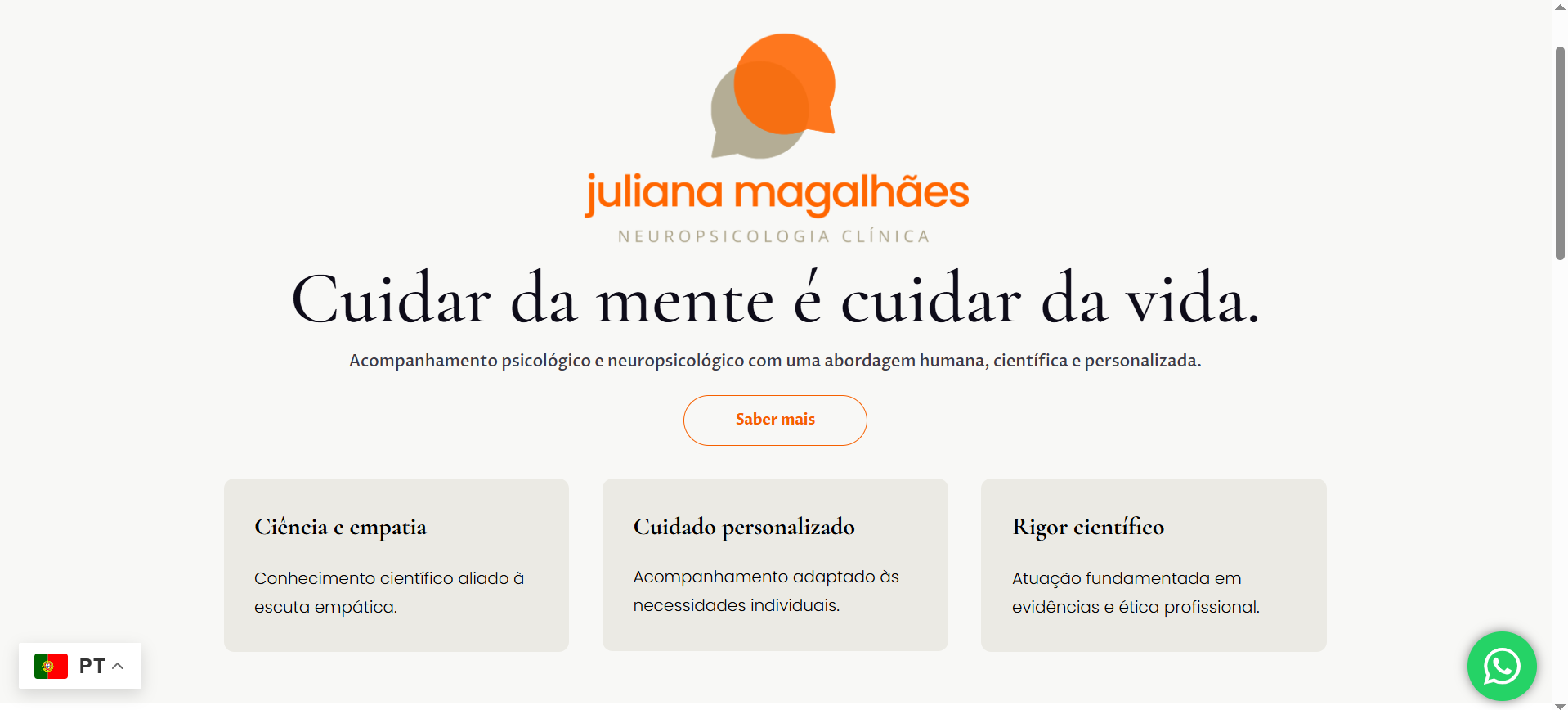
The initial delivery used the English headline "Taking care of your mind is taking care of your life" — a direct, warm statement that communicated the practitioner's philosophy before introducing any commercial offer. The revised final delivery moved the headline to Portuguese — "Cuidar da mente é cuidar da vida" — localising the emotional tone to the target audience. This Portuguese headline carries the same warmth and directness as the English version while feeling native to a Brazilian Portuguese-speaking visitor rather than translated.
The hero section was designed with a professional portrait of Juliana positioned alongside the headline — placing her face in the hero immediately establishes trust and personal connection, which is particularly important for a therapist website where the relationship with the practitioner is the core of the service. The warm neutral colour palette — soft terracotta, cream, and warm grey — reinforced the sense of safety and calm throughout the page.
Membership Tier Section
Below the hero and introduction sections, three membership service tiers were presented as clearly defined columns — a standard comparison layout, but styled in the warm neutral palette rather than the aggressive contrast and bold highlighting that most pricing table templates default to. For a mental health audience, the pricing section needs to feel like an explanation of options rather than a sales push. The column layout allowed prospective clients to understand the difference between tiers at a glance without feeling pressure-sold toward any particular option.
The membership plugin was configured with the three service tiers, each with its own access level and subscription parameters. The checkout and registration flow was connected to the tier structure so that a prospective client selecting a tier moved through a clear, simple registration and payment process without unnecessary steps or confusion. Simplicity in the membership checkout flow is critical for wellness and mental health sites where friction at the payment stage can cause a prospective client who is already hesitant to abandon the process entirely.
Membership tier design and subscription flow configuration is part of every WordPress membership website project at CodeSyte — with particular attention to the checkout experience for wellness and service-based membership sites.
About Section and Professional Positioning
The about section was built to introduce Juliana in a way that communicated both professional credentials and personal warmth. For a therapist, the about section is not a CV — it is the first stage of the therapeutic relationship. The layout placed her portrait prominently alongside the introductory copy, with the warm tone of the design reinforcing the personal and approachable nature of the content. A clear introduction to her practice philosophy, her approach to mental wellbeing, and the clients she worked with provided visitors with enough context to determine whether her approach felt right for them before committing to a subscription.
Portuguese Localisation and Revision Process
The revision process between Delivery 1 and Delivery 2 covered the full Portuguese localisation of the site — moving all visible copy from English-language placeholders and structural content to Brazilian Portuguese throughout. This included the hero headline, navigation labels, section headings, body copy, button text, membership tier labels, and footer content. The revision was communicated through the messages thread rather than the Fiverr revision form, which the client noted explicitly: "The revisions are mentioned and also being taken care of in the messages thread. Thanks!" — a clean, professional approach to managing revision scope that kept both sides aligned on exactly what was changing.
Full content localisation — where the entire visible site is in a language other than English — requires careful attention to text expansion. Portuguese copy is typically 20 to 30 percent longer than equivalent English text, which means Elementor column widths, button sizes, and text containers that look correct in English can overflow or wrap unexpectedly in Portuguese. All affected elements were adjusted during the localisation revision to ensure the layout remained clean at all content lengths.
The Result
What Was Delivered
- Full Portuguese-language WordPress membership website for Juliana Magalhães
- Warm neutral design — terracotta, cream, and warm grey colour palette
- Hero section with Portuguese headline "Cuidar da mente é cuidar da vida" and professional portrait
- Three membership service tiers in a calm, non-aggressive comparison layout
- Membership plugin configured with subscription parameters per tier
- About section with professional positioning and personal introduction
- Full Portuguese localisation across all visible content — headlines, body copy, navigation, buttons, and footer
- Text container and column width adjustments for Portuguese copy length
- Mobile responsive across all sections
- Delivered across two milestones — initial build January 7, revision delivery February 14, order completed February 17
Project Timeline and Patience
This project ran for approximately ten weeks from order placement to final acceptance — longer than the original five-day estimate, with three deadline extensions and one formal revision round. The client's consistent patience and professional communication throughout that extended timeline made the iterative process work. A complex, language-specific, emotionally sensitive membership website for a mental health professional requires more iteration than a standard business site — and the result is better for it. The final delivery screenshot shows a homepage that feels genuinely warm, professional, and appropriate for its audience.
Key Takeaway for Therapist and Wellness Membership Sites
Design Tone Is a Clinical Decision, Not Just an Aesthetic One
For a mental health professional's website, the colour palette, typography, hero layout, and overall visual tone are not just branding choices — they are clinical decisions that affect whether a prospective client feels safe enough to stay on the page. Harsh contrasts, bold aggressive pricing tables, and generic stock photography all signal the wrong environment for someone considering mental health support. Warm neutrals, professional portraiture, emotionally resonant headlines, and gentle layout spacing signal safety, calm, and human connection. The design must do the work of creating a sense of psychological safety before any content is read.
For Non-English Membership Sites, Test Every Text Container in the Target Language
Building a membership site in English and then localising it to Portuguese, Spanish, French, or any other language requires a full layout review in the target language — not just a content swap. Portuguese copy runs 20 to 30 percent longer than English. French runs similarly long. Arabic requires full right-to-left layout changes. Any text container, button, navigation label, or column width that was sized for English copy needs to be reviewed and adjusted when the content language changes. Skipping this review produces layouts where copy overflows containers, buttons wrap to two lines, and navigation labels get truncated — all of which undermine the professional presentation the site was built to achieve.
Membership Checkout Must Be Frictionless for Wellness Audiences
A prospective client on a mental health membership site who reaches the checkout page and encounters confusion — too many steps, unclear tier differences, a payment form that does not feel secure — will abandon the process at a rate significantly higher than a standard e-commerce customer would. The stakes of the decision feel higher, the emotional investment in reaching that page was greater, and the tolerance for friction is lower. Every step between "I want to subscribe" and "my subscription is confirmed" should be as simple and clear as possible. This is why membership checkout flow is one of the most important things to test thoroughly on any wellness or mental health subscription site before it goes live.
Final Thoughts
The Juliana Magalhães membership website is a quiet but meaningful case study in what a therapist's digital presence should feel like — warm, professional, emotionally honest, and simple to navigate from first impression through to subscription. The Portuguese localisation, the warm neutral palette, and the emotionally resonant hero headline all work together to create a site that feels genuinely appropriate for its audience and its purpose.
If you are a therapist, counsellor, psychologist, or mental health practitioner who needs a WordPress membership website that feels right for your clients — not just functional, but emotionally appropriate — that is exactly what I build at CodeSyte. Explore my full WordPress membership and wellness website services here, or get in touch directly and I will review your brief before we agree on scope or timeline.