WordPress Website for Architects: How I Built BD Architectural Studio’s Portfolio Site
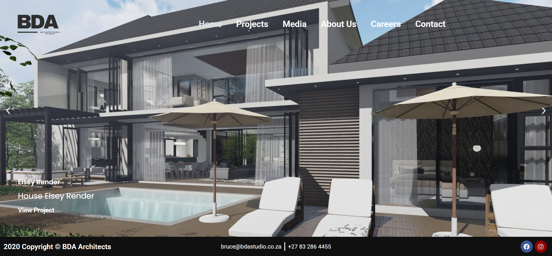
Most architects have stunning work but no polished way to show it online. Bruce ran a respected South African practice, BD Architectural Studio, yet his web presence didn't match the quality of his buildings. He came to me on Fiverr wanting a WordPress website for architects that felt as considered as his renders — clean, image-led and easy to navigate. This case study walks through how I designed and built his six-page portfolio site with Elementor and Divi, the revision rounds it took, and the practical lessons any design studio can borrow. It's written for creative professionals who need a site that sells their portfolio without fuss.
The Client & The Problem
Bruce reached out in May 2025 through my WordPress website development services. He already owned a domain and hosting, so the foundation was in place. What he lacked was a modern, structured site to display his architectural projects.
He knew the look he wanted straight away. He sent me a reference site and said, "please look at the attached website, I need something similar to this." The reference was bossarchitects.com — a spacious, photography-first layout. He wanted roughly four to six pages showcasing five or six completed projects.
The real constraints
Two things shaped this project. First, Bruce was not a technical user. Early on he asked me what a WordPress login even was, so I had to guide him gently through granting admin access. Second, he cared deeply about accuracy — project names, captions and spelling all had to match his records exactly.
He also had two firm requirements. The contact form needed spam protection so he wouldn't drown in junk mail, and his Facebook and Instagram accounts had to be linked correctly. These small details matter more than people assume for a working business site.
What I Proposed
I scoped a six-page WordPress site built with a combination of Elementor and Divi, priced at $250 with a 14-day delivery and four revisions. The pages covered Home, About Us, Projects, Contact Us, Media and a Careers section. My Elementor and Divi design work was a natural fit for the image-heavy layout he wanted.
To keep the workflow clean, I asked Bruce to drop all his images, logo and an "about us" document into a shared Google Drive folder, and to share WordPress admin access. This avoided messy email attachments and gave me a single source of truth for his assets.
I also confirmed the two must-haves upfront: a secured contact form and connected social profiles. For that I planned custom contact forms with spam protection rather than a bare default form, because architecture studios attract a lot of automated outreach.
The Build Process
This was a design-led build with plenty of iteration. The look came together quickly, but the accuracy work took real patience.
Designing to a reference without cloning it
Bruce reminded me more than once: "PLEASE KEEP THE BOSS ARCHITECTS WEBSITE IN MIND WHEN DESIGNING." I used that reference for structure and spacing — full-width project imagery, minimal text, a calm palette — while keeping his own logo, colours and identity front and centre. A reference is a compass, not a template to copy.
After the first draft went live, his early reaction was encouraging: "It looks great. Is it optimised for mobile viewing?" That flagged mobile responsiveness as the next priority, so I tightened the layout across smaller screens.
Getting the project details exactly right
The biggest chunk of work was content accuracy. Bruce needed each project named precisely — Dainfern, Pearl Valley and others had been mis-spelled or mislabelled in early drafts. Several project cards had the wrong captions attached to the wrong images, so I cross-checked every one against his Drive folders.
I also removed leftover demo content that had carried over from template elements, including stray text like "Crisp Rendering" and unrelated builder names. On the Projects page, a hidden expandable panel was pulling in placeholder information, so I stripped that out to keep each project clean.
Fixing readability, media and links
The contact page originally used yellow and dark text that was hard to read. I switched to a clean background with clear black type for proper contrast — a small change with a big usability payoff, and part of the same attention to detail I bring to speed and optimisation services.
On the Media page I embedded two of Bruce's YouTube videos, then removed unwanted overlay caption text that appeared on both. I corrected the Instagram and Facebook links so they pointed to his real profiles, made the Shark Bay House image the first hero slide, and removed the Careers page once he decided it wasn't needed.
The Result
By the final delivery, BD Architectural Studio had a live, six-page portfolio website that mirrored the polish of the reference while staying true to Bruce's brand. The projects were named correctly, the imagery led each page, the contact form was protected against spam, and the social links worked.
Bruce's feedback through the revision rounds stayed warm and appreciative. After a batch of corrections he wrote, "many thanks for the changes, greatly appreciated." The site now gives his practice a professional home online, built on portfolio and business websites that are easy for a non-technical owner to maintain.
Key Takeaway
This project is a reminder that architecture sites live or die on accuracy and presentation, not just visual flair. A beautiful layout with the wrong project caption undermines trust instantly.
Three lessons for design studios
First, use a reference as direction, not a copy — match the feel, keep your own identity. Second, lock naming and content early; supplying clearly labelled folders from day one saves multiple revision cycles. Third, never skip contrast and spam protection, because a site that's hard to read or floods you with junk mail costs you real enquiries.
If you run a creative practice and need a site that shows your work the way it deserves, this is exactly the kind of build I do every week. You can start your own project with CodeSyte and get a portfolio website that's fast, accurate and genuinely yours.