
Building a Conversion-Focused WordPress Wellness Landing Page with Multi-Payment Integration
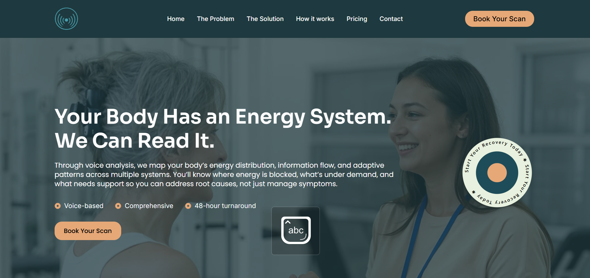
You have the copy written, the pricing finalised, and a clear service to sell. What you need is a single, clean, professional WordPress landing page that explains your offer clearly and lets people book or buy without friction. That brief sounds simple — and it is, when executed well. When MyWellnessScan came to CodeSyte with exactly that brief, the project involved a clean WordPress wellness landing page with a voice biomarker health assessment service, three pricing packages, and a full payment stack including Stripe, Apple Pay, Klarna, Affirm, and PayPal. This post covers every decision made from domain setup through to mobile checkout optimisation — and what any wellness brand launching a conversion-focused website needs to think about before they start.
The Client and the Problem
Who They Were
MyWellnessScan (mywellnessscan.com) is a wellness technology brand offering voice-based biomarker health assessments. Through a 10-second voice recording, the service analyses vocal biomarkers linked to stress, energy system demand, and physiological imbalance — producing a measurable snapshot of what is happening beneath the surface, delivered within 48 hours. The service was offered across three packages at clear price points, and the brand direction was explicitly defined: clean, professional, and neutral — not overly alternative or medical in tone.
What Was Not Working
The client had everything a launch-ready website needs except the website itself. Full landing page copy was written and structured by section. Service offerings and pricing were finalised. Brand direction was clear. What was needed was a developer to implement the copy accurately, design a layout that matched the premium wellness technology brand position, and integrate a payment stack that gave customers multiple checkout options.
One practical issue also needed to be resolved before development could begin: the domain (mywellnessscan.com) on Hostinger had not been connected to the WordPress installation. Nameservers were not pointing correctly, meaning the WordPress admin dashboard was not accessible. This is a common hosting setup step that catches many first-time website commissioners — once the nameserver update propagated, the build could begin. Domain and hosting setup troubleshooting is part of what I cover in my WordPress setup and development services at CodeSyte.
What I Proposed
$300 Fixed, 8 Days — Clean and Conversion-Focused
The scope was deliberately kept lean — matching the client's explicit request for no blog, no complex backend, no memberships, and no unnecessary features. A single primary landing page with clearly structured sections, fully responsive design, the client's copy implemented exactly as written, booking or checkout integration, and basic SEO structure. That is the brief. That is the build.
For the payment and booking integration, Stripe was recommended as the primary gateway — it supports Apple Pay natively, has clean WooCommerce integration, and handles one-time purchases for wellness packages cleanly. Klarna and Affirm were added as buy-now-pay-later options to reduce purchase friction on higher-value packages. PayPal was included as a trust signal for customers who prefer not to enter card details directly. All four were configured through WooCommerce's payment gateway settings.
The Build Process
Design Direction — Premium Wellness Technology, Not Spa
The initial design delivered was clean and structured but leaned toward a spa or lifestyle aesthetic — warm tones, soft imagery, a template feel. The client's feedback was direct and accurate: this is a premium wellness technology brand, not a day spa. The reference mockup she shared was higher contrast, more technical in feel, with a darker colour palette and a more confident layout hierarchy.
The template was updated to match: darker section backgrounds, stronger typography contrast, a more structured What We Measure section with custom icons matching the brand's technology-forward positioning, and a hero section updated to the client's final approved copy: "Your Body Has an Energy System. We Can Read It." — followed by a clear explanation of the voice analysis methodology, delivery timeline, and a Book Your Assessment CTA. This design direction shift is exactly the kind of feedback that makes the final product significantly better — and it is why having a reference image or mockup available before the build starts saves revision rounds. Clear visual references are part of every pre-project brief I collect for WordPress landing page and brand website projects at CodeSyte.
The What We Measure Section
The core service explanation section — What We Measure — was restructured using the client's provided content document covering vocal biomarker categories: energy distribution, information flow, adaptive patterns, system demand, and stress markers. Custom icons were applied per category with hover effects added to improve interactivity and signal that each card was clickable or informative. The visual layout matched the client's reference mockup more closely than the original template — cards with clear category labels, supporting text, and consistent spacing.
Payment Stack Configuration
Stripe was the primary gateway, configured through WooCommerce Payments. Apple Pay was enabled through Stripe's express checkout settings — appearing automatically on Safari browsers on iOS and macOS. Klarna and Affirm were configured as separate buy-now-pay-later gateway options, displaying at checkout for eligible purchase amounts. PayPal was added as an additional checkout option.
One issue arose post-configuration: when the client attempted a test purchase, no payment methods were displayed. This was a WooCommerce checkout configuration issue — payment methods had been installed at the plugin level but not fully activated within the WooCommerce payment settings dashboard. A screen recording walkthrough was provided showing exactly how to connect each payment account — the client needed to authenticate her own Stripe, Klarna, Affirm, and PayPal accounts before the methods could display at checkout. This is a common confusion point: installing a payment gateway plugin is not the same as connecting your payment account to it. A recorded walkthrough is far more effective than written instructions for this step.
Mobile Checkout Optimisation
After the payment methods were configured and the client completed her review, one final issue was flagged: the mobile checkout screen was not fully optimised — content was being cut off on smaller screen widths. WooCommerce's default checkout page styling does not always render correctly on all mobile viewport sizes when custom themes are applied. The checkout page was restyled for mobile, ensuring the order summary, payment method selector, and submit button were all fully visible and functional on small screens. This was confirmed resolved before final delivery.
Additional Fixes During Revision Rounds
Several small but important issues were caught and fixed during client review: the navigation bar background colour was changed from green to black per client preference, a typo in the Buy Now button text ("buy yow" corrected to "Buy Now"), and the Who Is This For section was updated with the correct copy after an earlier version had incorrect placeholder text. The mobile logo was centred in the navigation menu as the client had specified — a layout detail that matters significantly on mobile where the header is the first design element visitors see.
These kinds of post-delivery polish items are normal on any landing page project and are exactly why revision rounds are scoped into the project from the start. Catching a button typo before a customer sees it is part of proper quality assurance. This is covered under every WordPress conversion landing page project at CodeSyte.
The Result
What Was Delivered
- Single-page WordPress landing page live at mywellnessscan.com
- Hero section with final approved copy and Book Your Assessment CTA
- What We Measure section with custom icons, hover effects, and voice biomarker category cards
- Three-package pricing section with clear service tiers
- Who Is This For section with correct copy
- Stripe payment gateway with Apple Pay express checkout
- Klarna and Affirm buy-now-pay-later options at checkout
- PayPal as additional checkout option
- Black navigation bar with centred mobile logo
- Mobile-responsive checkout page fully optimised
- Video walkthrough guide for connecting payment accounts
- Delivered within budget at $300
Client Response
After the final round of fixes was confirmed: "Excellent, thank you." The client expressed appreciation for the communication throughout the project and confirmed the build matched her vision for a premium wellness technology brand. The project was completed during a period when the client was unwell — an extended review window was accommodated without pressure, which the client acknowledged directly.
Key Takeaway for Wellness Brand Landing Pages
Your Visual Reference Is as Important as Your Copy
The client had exceptional copy — well-structured, brand-appropriate, and ready to implement. What she did not have at the start was a clear visual reference for the design direction. The gap between "clean, professional, neutral — not overly wellness or medical" as a written description and the actual mockup she shared partway through the project was significant. The mockup was more technical, higher contrast, and more confident than any standard wellness template. Sharing that reference at the start of the project would have produced the right design on the first review rather than the second. If you are commissioning a landing page, prepare both: your copy and at least one reference image that shows the aesthetic you are aiming for.
Installing a Payment Plugin Is Not the Same as Connecting Your Account
This distinction trips up almost every first-time WooCommerce store owner. A payment gateway plugin — Stripe, Klarna, Affirm, PayPal — enables the connection between WordPress and the payment provider. But the connection only works when you authenticate your own merchant account inside the plugin settings. Until you do that, the payment method installs but displays nothing at checkout. If your WooCommerce checkout shows no payment methods, the first thing to check is whether you have completed the account connection step — not whether the plugin is installed.
Mobile Checkout Is a Conversion Decision, Not a Design Detail
A beautifully designed landing page with a broken or cut-off mobile checkout loses sales on the device that most visitors use. The checkout page is the highest-stakes page on any e-commerce or service purchase site — and it is the one that most commonly has mobile responsiveness issues because it sits outside the main page builder workflow. Testing the full purchase flow on a real mobile device — not just a browser resize — before delivering any payment-integrated website is non-negotiable. This is part of every QA process I run on WordPress e-commerce and landing page projects at CodeSyte.
Final Thoughts
MyWellnessScan is a clean, focused case study in what a well-scoped landing page project looks like: a clear brief, copy ready before development began, a payment stack configured correctly, and a design direction that evolved from a good first draft to an accurate premium wellness technology brand expression through clear client feedback.
If you are launching a wellness brand, health technology service, or any product or service that needs a single conversion-focused WordPress landing page — with a payment stack that works correctly across Stripe, Apple Pay, Klarna, Affirm, and PayPal — that is exactly what I build at CodeSyte. Explore my full WordPress landing page and e-commerce development services here, or get in touch directly and I will review your copy and brief before we agree on scope.